UI Modernization - Icon Strategy
Fellow capsuleers,
EVE developers have been quite busy in the past few weeks working on gameplay features, which is good because that‘s what they are supposed to do! But concurrently, various members of these teams have also been working on a cross-disciplinary project called EVE UI Modernization.
Our latest efforts in this project is to deliver on a promise we identified as one of the principles of the EVE UI: a holistic icon strategy where we make all things in EVE that have a uniquely defined role, function or purpose have their own distinctive icon. This plan needs to be taken in steps because it covers pretty much everything in our client, from item icons to UI icons and will take time to fulfill. The long term goal is that in the foreseeable future we will no longer see the same item icon for two different modules or other things. For now however, we are starting with UI icons only and the first thing we want to tackle is icons displayed in the Overview and in-space environment.
What are the goals?
We want to ensure that all items which exists in the game and have a uniquely defined role, function or purpose should have their own distinctive icon.
Where should we start?
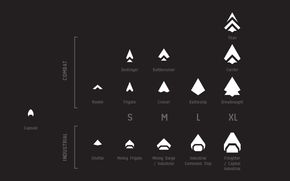
When we released the Ship Identification System we created new Ship Groups to identify different ship classes and sizes with unique icons. The plan was to introduce them to other areas of the game once they had proven themselves within the Ship Identification System. It was a low risk to introduce it there first since it didn’t have direct impact on high-stakes gameplay. When we first designed them we wanted them to be distinguishable from each other at a glance. At the time of validating that, we would always have all the icons visible together so it was easy to distinguish them by having them all visible to compare against each other. We needed to cater to the use case of them popping up one by one without the luxury of seeing the other ones to compare. We therefore did some slight iteration to them to ensure they would be recognizable on their own as well. However, we did not want to drastically change them because the underlying style had proven itself and players have learned to identify them individually.
Ship Group Icons – Design Sheet:
(click to enlarge)
The new Ship Group Icons are almost identical to the old ones but with slight important iterations to help identify them more easily on their own.
So we decided to take on the icons in the Overview and make sure to never have the situation where an icon was used for multiple things that had different role, function or purpose.
What are we changing?
We decided to look at all things that can be displayed in the Overview and put them into 4 primary categories:
- Ships - All man-made objects in space that can travel/move
- **Structures - **All man-made objects in space that don’t travel or move
- **Celestials - **All objects in space that are not man-made
- O**ther - **Anything that doesn’t fit the definition of the other groups
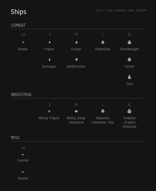
SHIPS
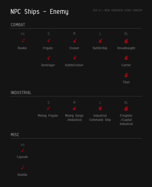
Once we had iterated on the Ship Groups we wanted to also tackle NPC ships and make them consistent so that all ship groups would have the same base look. We re-authored all icons tied to NPCs, making them visually consistent with player ships with an added ‘+’ icon in the upper-right corner to identify NPC ships specifically. This was to address the fact that some NPCs can be neutral and are therefore displayed in the same white color as player ships but also to ensure that we are not using color as the primary method of identification but rather as a secondary emphasis. This is part of our ongoing mission to use shapes as the primary way of identifying UI objects, which should cater specifically well to those with color blindness, but is also simply a proven preferred way for all humans to store information.
In-game sizes for Ship Group Icons:

DRONES
Since we had our drawing pens in hand anyway and we had created a new authoring system for defining ship groups. We decided to go ahead and create new group icons for drones as well. Using the same reasoning as used for the initial design of Ship Groups we came up with a way to categorize drones in a way that would make sense and be of use in combat situations and other engagements with drones (not all interactions with drones are bad).
We created base shapes in a similar way we did for ships and different bulkiness feel to each size within a class to identify the sizes of the drones. Using the base shapes we then added attribute icons in the upper-right corner to identify the primary role, function or purpose of each drone. This will give a huge advantage for players that need to take strategic decisions regarding drone targeting as well as knowing at a glance what drones you, your allies or your foes have on grid.
Drone Group Icons – Design Sheet:
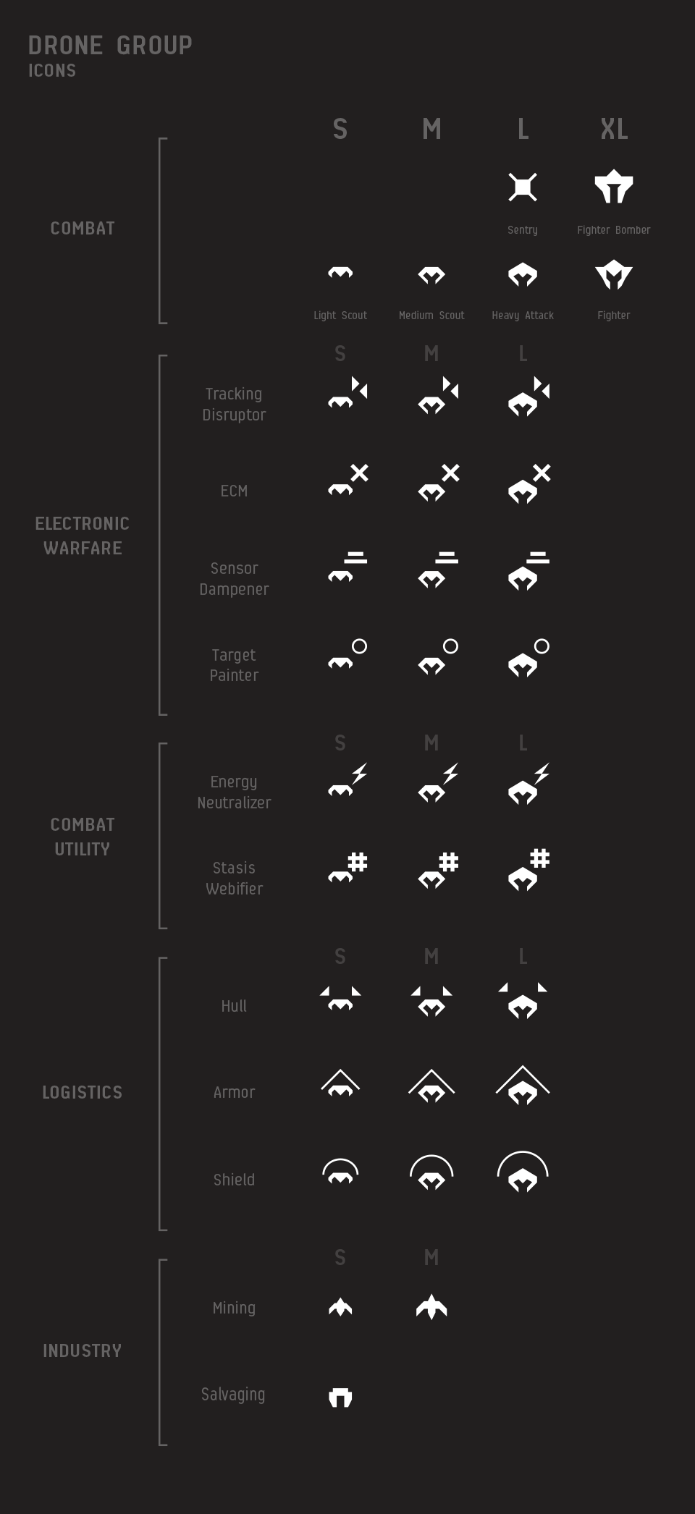
In-game sizes for Drone Group Icons:

STRUCTURES
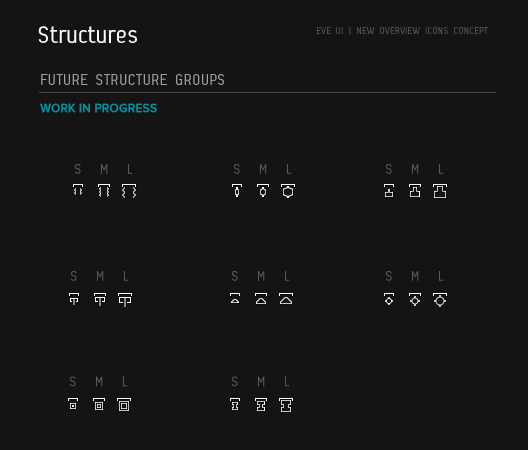
We are currently doing extensive discovery (research) work on Structures in EVE so it made sense to make a longterm strategy for how we would display icons for them in the client. The rollout of this will of course rely on the progress of the much larger plan for structures so no promises for when this will go out, but we still wanted to show it to you to give you all the details of our complete icon strategy.
Structure Group Icons – Design Sheet:
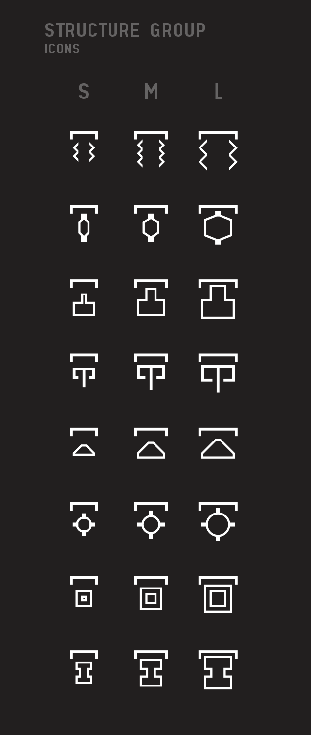
In-game sizes for Structure Group Icons:
The final names and even amount of structure groups are very much work in progress and might very well change in the coming weeks. But the underlying strategy for how they are visually represented is very much in alignment with our approach for the Ship Groups and Drone Groups. We use a base shape to identify that this is a structure (the downward facing bracket at the top). Then we use a specific shape to identify the purpose and finally show that base shape in different sizes to represent the different structure size. In this current design example, the Small, Medium and Large represent structures for Personal, Corporate and Alliance use. But again, such details on the functions and mechanics of structures might change.
CELESTIALS
The Celestials group had the most interesting cases. We couldn’t simply just say that all things that were different should have different icons. We need to make sure we are not introducing too many things for players to learn so we had to also be selective to what things were worth having a distinction between. We definitely felt ships, drones and structures with different roles, function and purpose fully deserved unique icons, but what about different celestials. Even if they are different in some ways, do they deserve a unique icon? Is there actual gameplay difference that supports that decision? The things we looked at where things like suns, planets, belts and sites.
We decided not to make different icons for different types of suns because at least currently we don’t have specific gameplay around suns. If we would however then we would be sure to revisit the icons so this icon strategy is a living breathing effort that will react to any interesting changes to gameplay.
Another thing we consciously did not want to differentiate was different wormhole classes. The classes are not supposed to be easily spotted at a glance but rather something you investigate and explore so we did not want to tinker with the interesting mysterious gameplay that provides.
OTHER
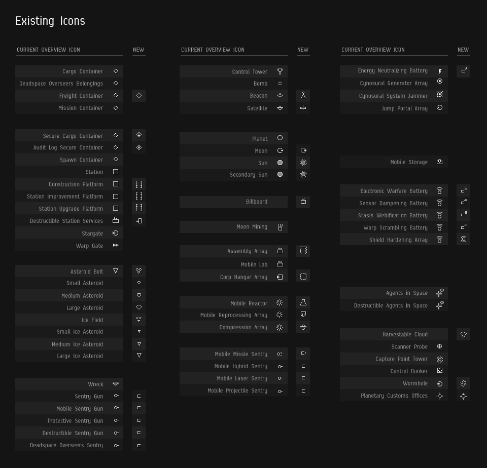
With so many new icons introduced into the Overview we had to make sure the old ones still made sense on their own. We therefore looked at all the existing icons to see if there was a way to improve them based on the strategy we used when creating the new group icons for ships, drones and structures.
Many of the icons have existed in the game since the initial launch and if we had the chance to rethink them visually we probably would have done things slightly different knowing what we know now. So we did an iteration pass on all the existing icons, making changes based on our strategy and goals where it made sense by having all things with unique purpose have unique icons. We still wanted to make sure we weren’t just change things for the sake of changing them, because we completely understand that many of these icons have become stored both in our player’s long term memory and in their muscle memory, but as things have evolved throughout the years some icons have become too out of style with the overall visual strategy. We hope to have a good discussion with the community regarding these proposed changes to reach a consensus that brings added value to the community in the long run.
(click to enlarge)
How will this look in client?
We could try to explain it to you and say that we think it looks great and that we believe it will make interactions, encounters and engagements much more interesting once they are on TQ. But instead of all that, let us just show you. We are deploying this to SiSi now so that you can try it out for yourself so go and check it out and give us your thoughts and feedback on it. We want this to have a positive and meaningful impact on gameplay and ask that you try it out with an open mind. All drastic changes to iconography takes time to get used to, but we hope with time you will be able to recognize at a glance a much broader range of things in your surrounds than before.
If you can’t for some reason check it out on SiSi right away, here is a screenshot from our development client that shows how the client looks with the new icons.
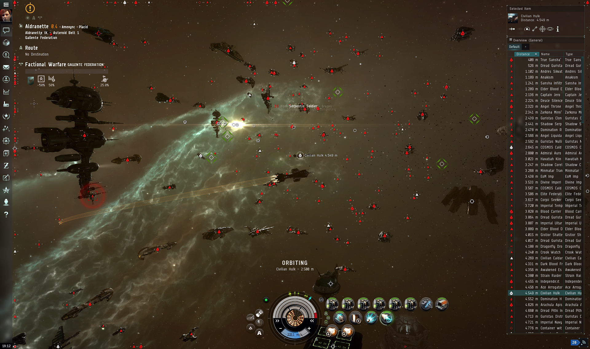
(click to enlarge)
Going forward
If you feel like you need more details, check out the video recording of the o7 show from February 26th 2015. There we presented in more details how it will look in client.
Once we have polished these icons and validated that they are bringing you the value we intended for them, we want to find ways to include them wherever it makes sense to have them. We also want to make sure 3rd party developers can get their hands on these new icons once they have been finalized and validated. We will send out a news announcement when that time comes and we have updated the IEC zip files.
That’s it for now folks. From the various feature team developers working tirelessly on both features and the UI Modernization project we hope you like these changes and are willing to try them out and give us your feedback. Give us your thoughts in the blog comments and if you happen to be coming to Fanfest this year there will be plenty of panels and roundtables to discuss in great details all things related to the UI Modernization project.
Fly safer and more informed with more descriptive icons.