Iconic Ships Reimagined - The Minmatar Rupture
Hello ship posting space friends,
I'm CCP Pointy Bits and in this blog, I’m going to go through the design process behind the new Rupture-class cruiser and talk about our general thoughts on redesigns and graphics renovation in the art department on EVE.
First, we’re going to go on a bit of a preamble about how redesigns are important to the artists here.
Why do we do redesigns?
EVE is a vast and beautiful universe, yet it was designed in the early 2000s by a very small concept art team in a very different and still fledgling world of 3d graphics. Concept art at the time, like much of the industry, was still done on paper and scanned. During that time EVE was also in a formative state fueled by CCP’s large ambition. It was impossible to know what designs would get cut, what would get repurposed, and how the style would evolve even during those early production days.
Over the years, CCP has grown and evolved to adopt more modern workflows, disciplines have changed to reflect industry practices, and our art style has shifted due to advances in graphics technology. Originally a dark, foreboding universe without complex materials on ships, EVE embraced these limitations with a dark, cyberpunky dystopian art direction. Space was cold and empty. Limitations on texture sizes, reduced polygon counts, and a simple lighting engine meant ships could be incredibly ambiguous with shapes and details, allowing user imagination to take over and fill in the details of these starships. Like many games at the time.
Reimagining this universe and keeping it visually up to date, both in terms of actual asset quality and art direction, has been an ongoing challenge. Since inception, EVE has been a visually stunning game, causing business partners and journalists of 2003 to disbelieve that screenshots were done in-client. Beginning with the Trinity expansion (2008), in which we overhauled our graphics engine, updated our texturing approach to lay the ground work for modern shader techniques, and reworked every new ship design we’d released, our older ships began to show their legacy. They haven’t quite fit in with the new design languages we’d adopted or they suffered from poor conversion during shader model updates.
Ships that have been left behind in these conversions, needs to be updated. Which brings us to the point of this blog – how do you reimagine designs that have been iconic to players and fans for over a decade?
What’s going on in our heads?
My personal approach is to try and figure out some of the history of the ship. The end customer for a redesign in my mind is both an existing player and potential players who have never seen these ships before, and balancing both of those is a highly interesting challenge for an artist. We have to overcome our own personal stylings and tastes and put ourselves in the shoes of someone else who may be incredibly attached to each ship. Like a building renovation, we need to identify what stays and what goes. What does the design emotionally convey? What is the function of the hull in game? How do we pull those out into the forefront even more?
With the Rupture, I spent a fair amount of time talking about the design with players and absorbing their opinions and stories. I had a sketch sheet from the first few days after starting at CCP of random Minmatar ships, trying to figure out their stylings and interesting new ways to arrange them. After showing them to our art director I began to mix them together into some more recognizable Minmatar shapes.
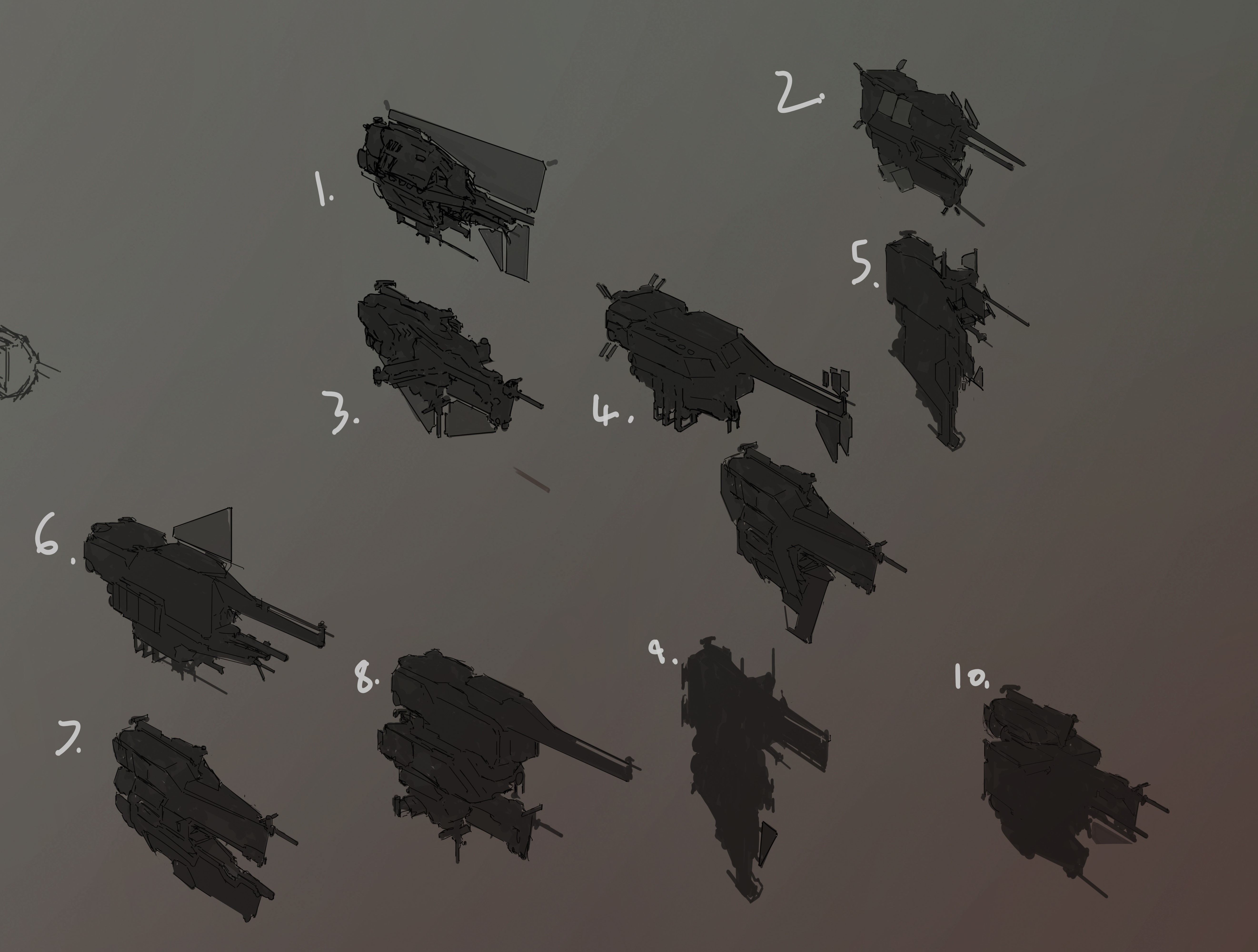
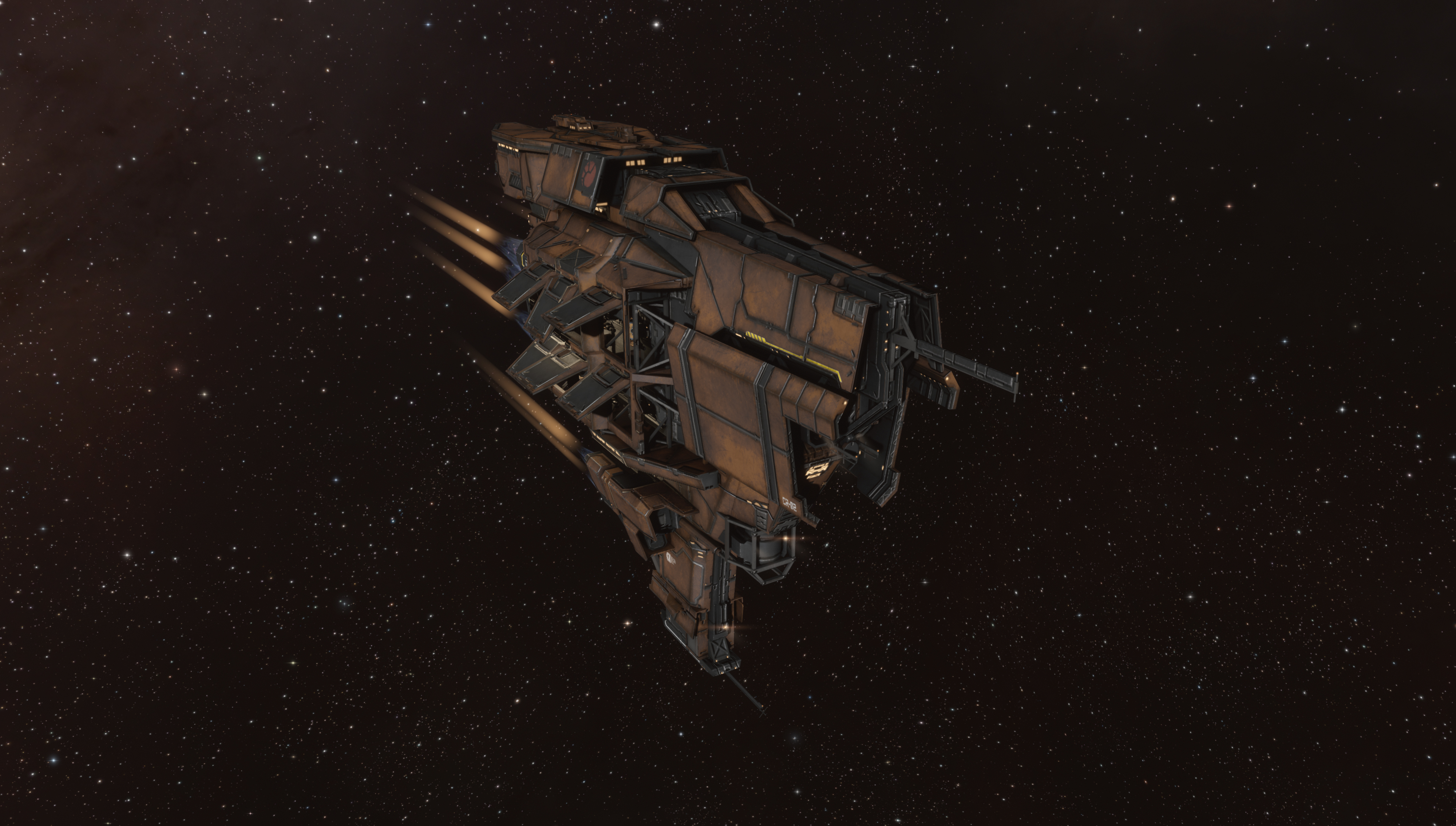
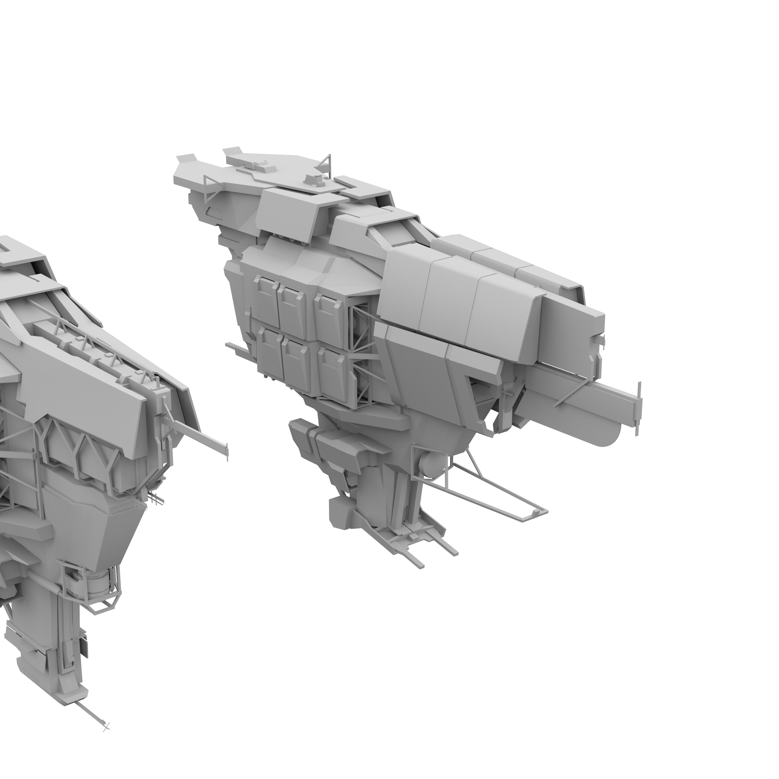
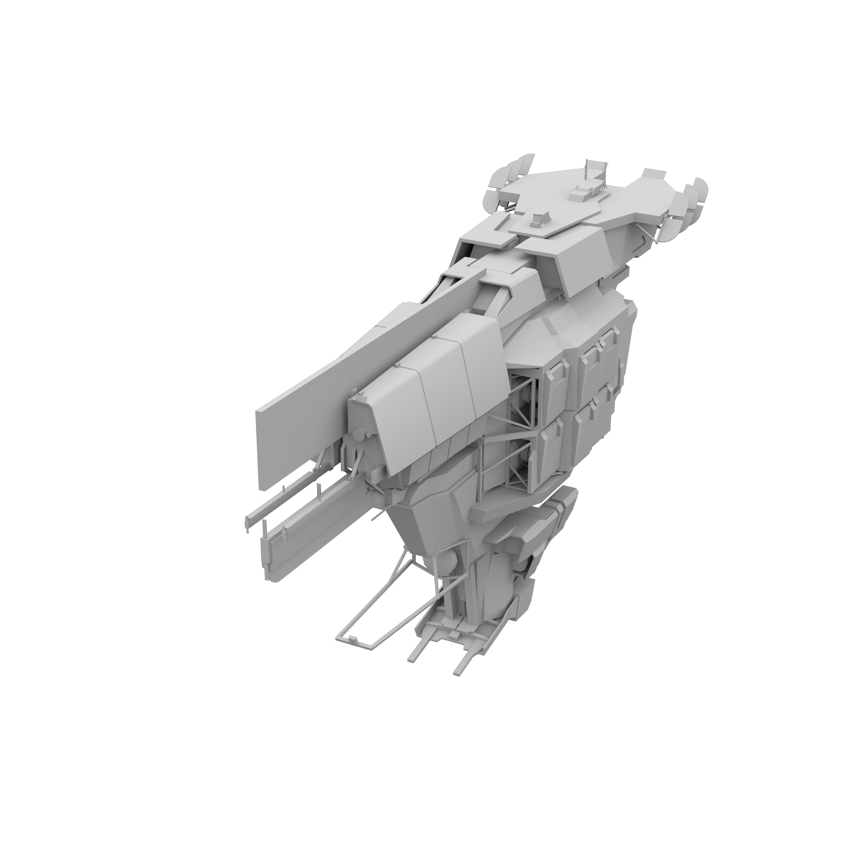
I came back to this after a while and picked one sketch to start building a potential Rupture redesign off. Early on, the most important thing was keeping the aggressive wedge shape with a fairly sturdy rear section that would sit high up and some hull that continued downwards to give the ship it’s iconic vertical presence.

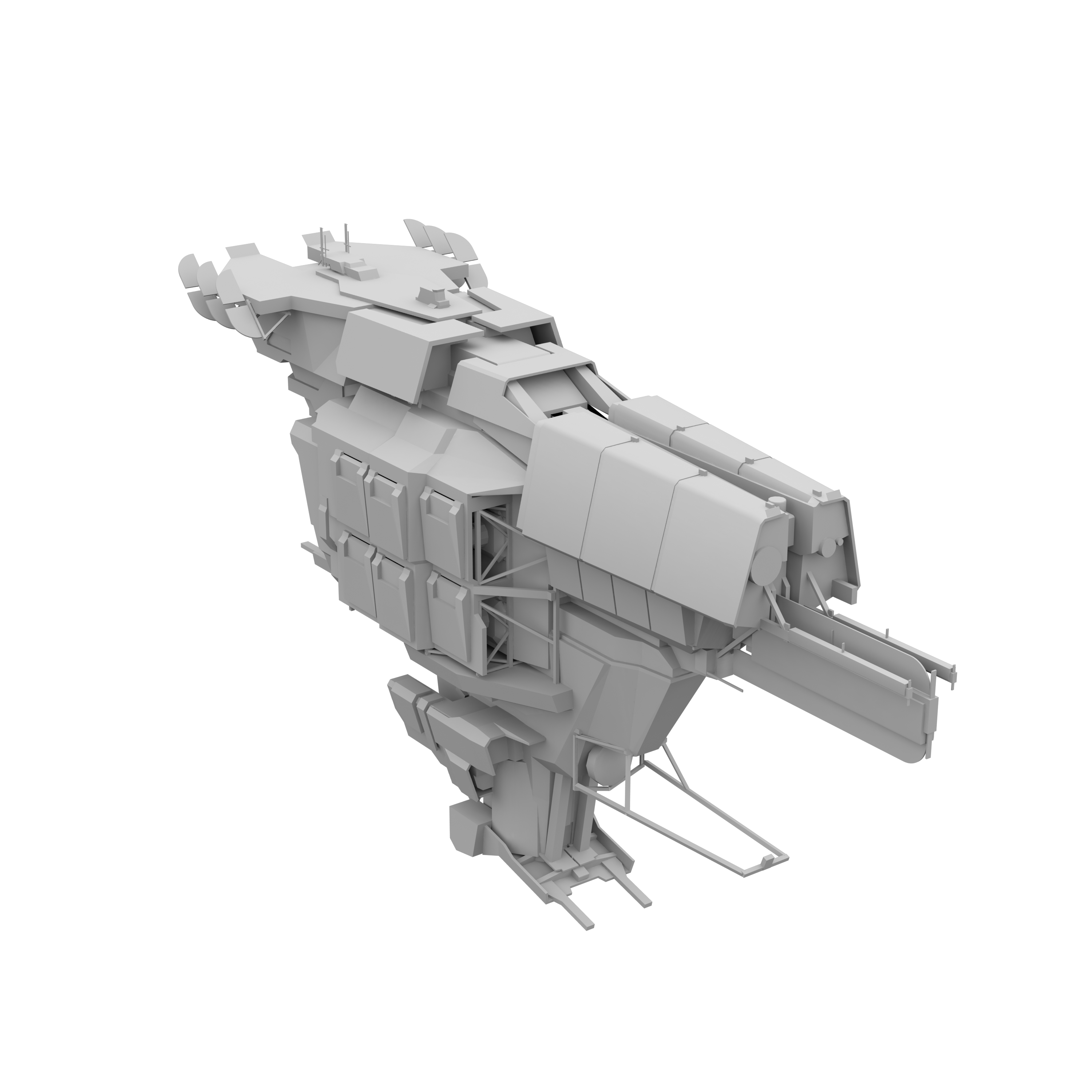
From there I started copy pasting around the basic shape and iterating on it, taking parts out and rearranging them. Here is where we probably made our first change compared to the current Rupture. We knew players, and our artists, liked the transom back (shout out to the dude who taught me that word!) that made it look a bit like an old galleon or pirate ship, and we wanted to carry that theme a bit through the rest of the ship. Compared to the old hull having slightly erratically placed guns, I wanted a battery of guns on each side like it’s big brother, the Tempest. We’d take it one step further by placing them in gun ports that would open as it came out of warp like the Onyx redesign.
You can also see some very early explorations of how we’d “bolt on” some tech 2 geometry for the variants, but in between these sketches and the design going into production, we slightly changed how we handle tech 2 variants by assigning them sections of the texture sheet, and cleanly cutting geometry where we attach them to make sure we have room for larger changes.
Iterative production
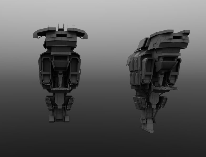
When we finally got the go ahead to enter production for the redesign, we had a pretty solid basis to go on. I did some very messy blockouts early on that identified lots of issues with the designs that are hard to identify in 2d. There were so many shapes that we couldn’t easily transition from one to another, and once in 3d after merging conflicting angles together, we felt like the design was looking a bit too much like a busy Caldari design. CCP BunnyVirus began doing his own blockout that was a bit cleaner and blockier, and from there we began to better work things out.
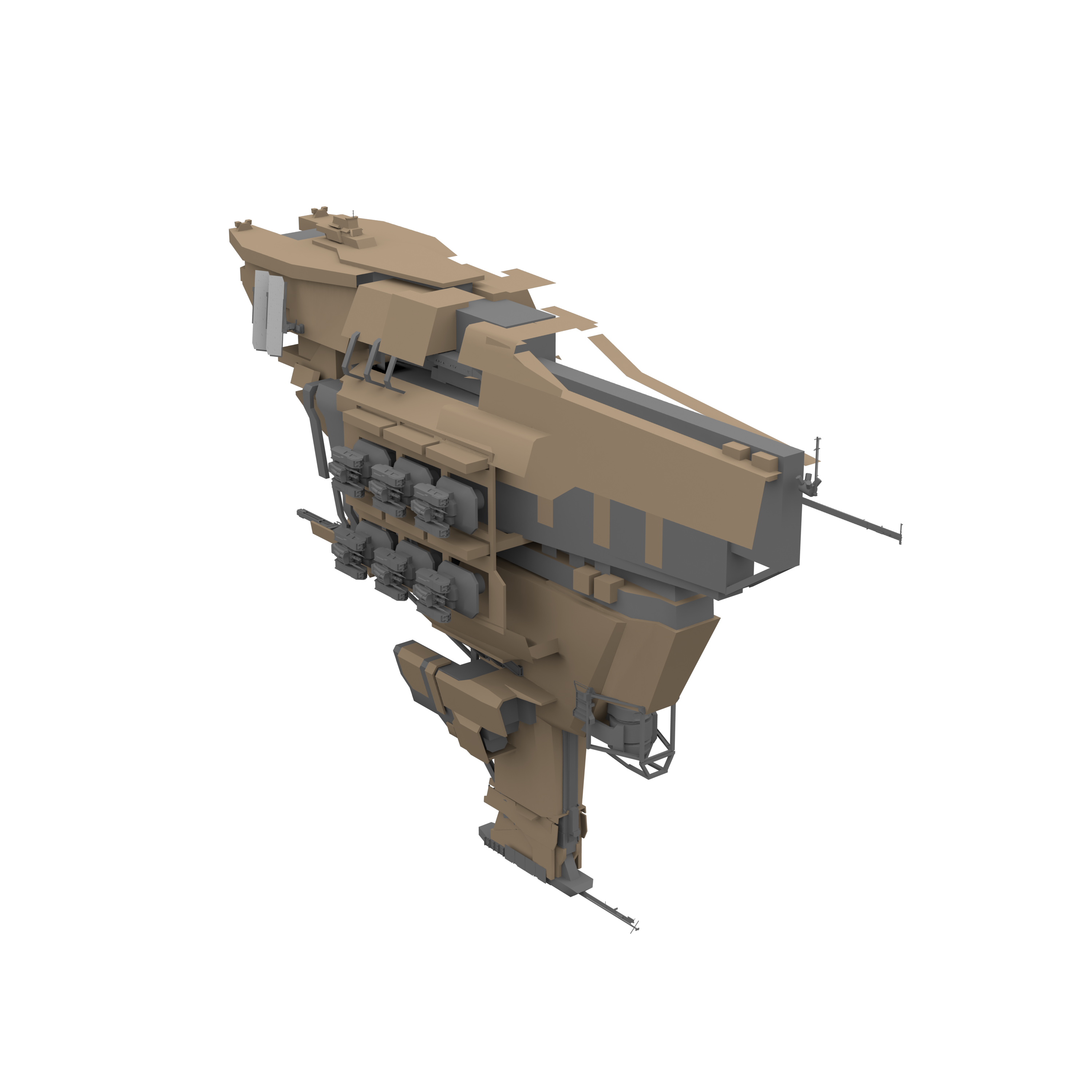

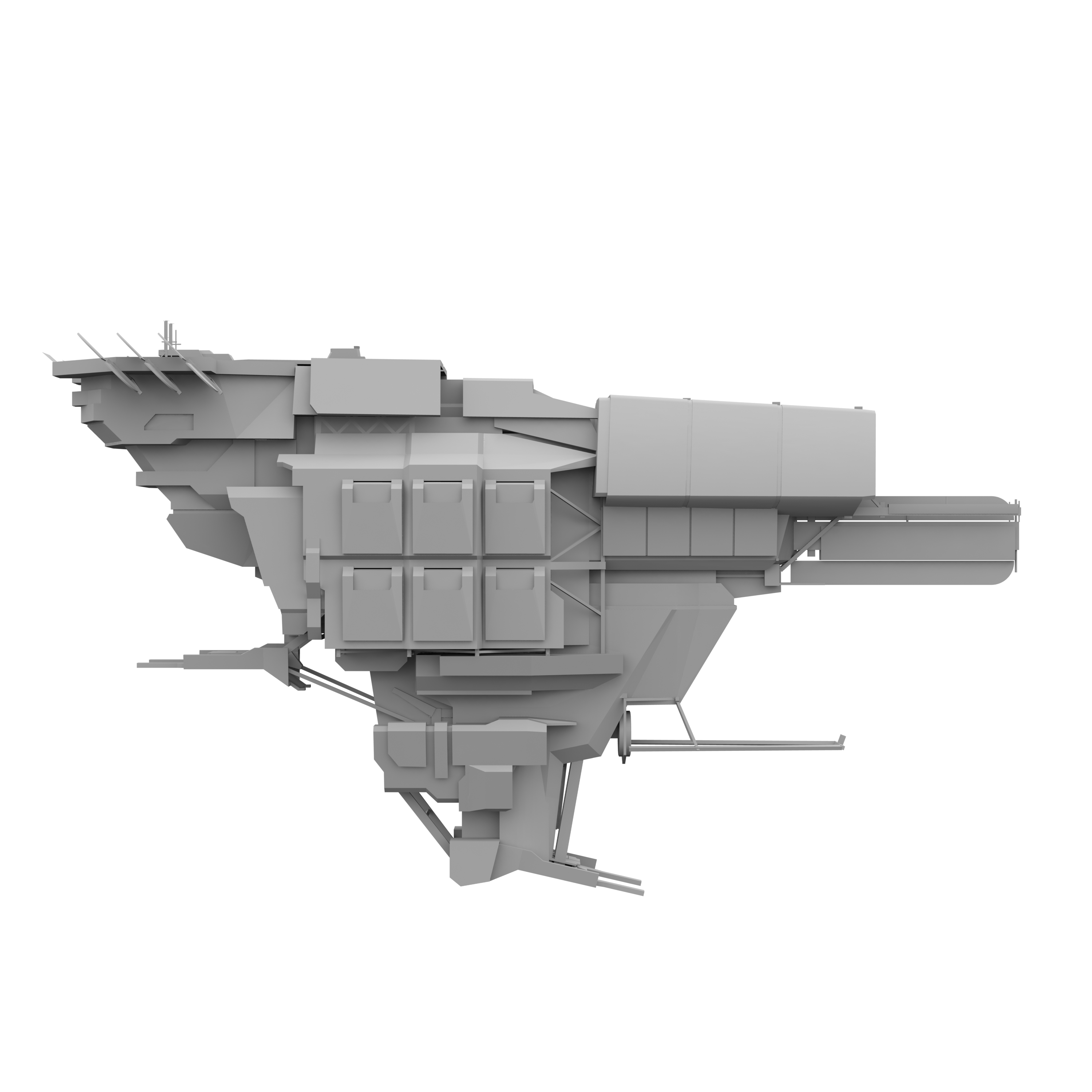
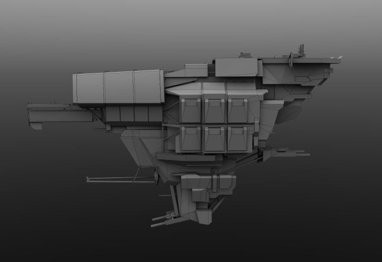
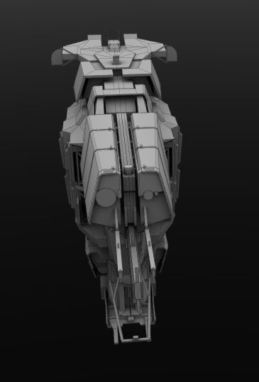
Our biggest initial problem was that, despite being happy with what was generally going on, a lot of our decisions meant that we’d lost some subtle angles of the original Rupture and made the sides too flat. Our art director had the idea that the gun bay should be visible, with players able to see the tucked away turrets inside of an armor plating. The complexity of making this work had massively inflated the size of the hull around the gun ports, which resulted in this very flat side as you can see above. From the side the ship looked great, but when viewed directly from the front and top it felt too monolithic.

I looked a lot at the original Rupture’s silhouette, and we tried to add in very subtle changes that wouldn’t interrupt the ship’s firing angles or require us to clumsily add in tertiary turret locators. We also slightly angled the gun port covers to add a downward slant, which helped break up the 90-degree angle when viewed from the front, exaggerating the ship’s inverted pyramid shape.
Design space
There was a recurring problem both with this design and the Bantam redesign over the blurry lines between Minmatar and Caldari design spaces. Both use large, flat shapes and live dangerously close together, so this was an opportunity to think about what our goals are for Minmatar and how to contrast that with all our new Caldari redesigns.
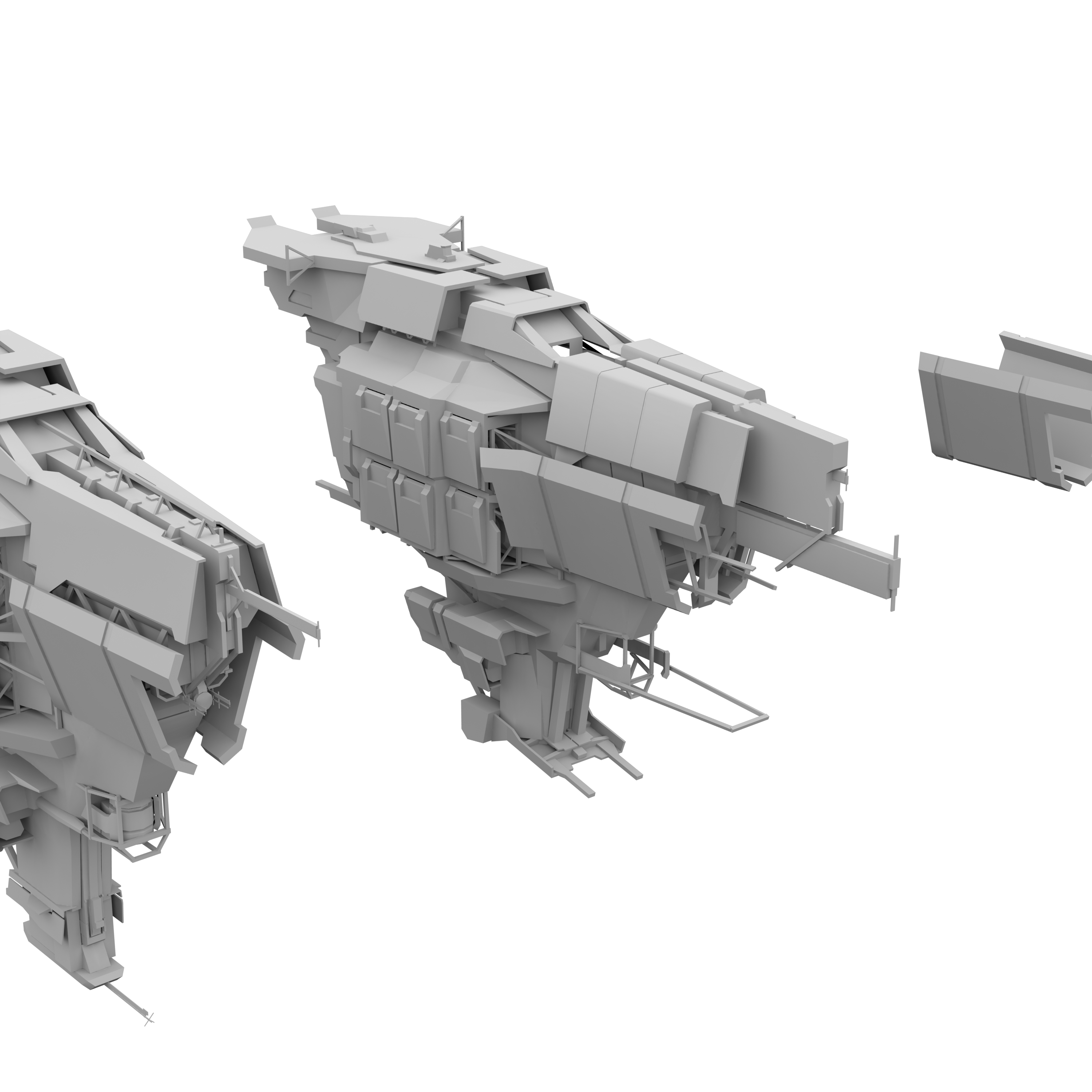
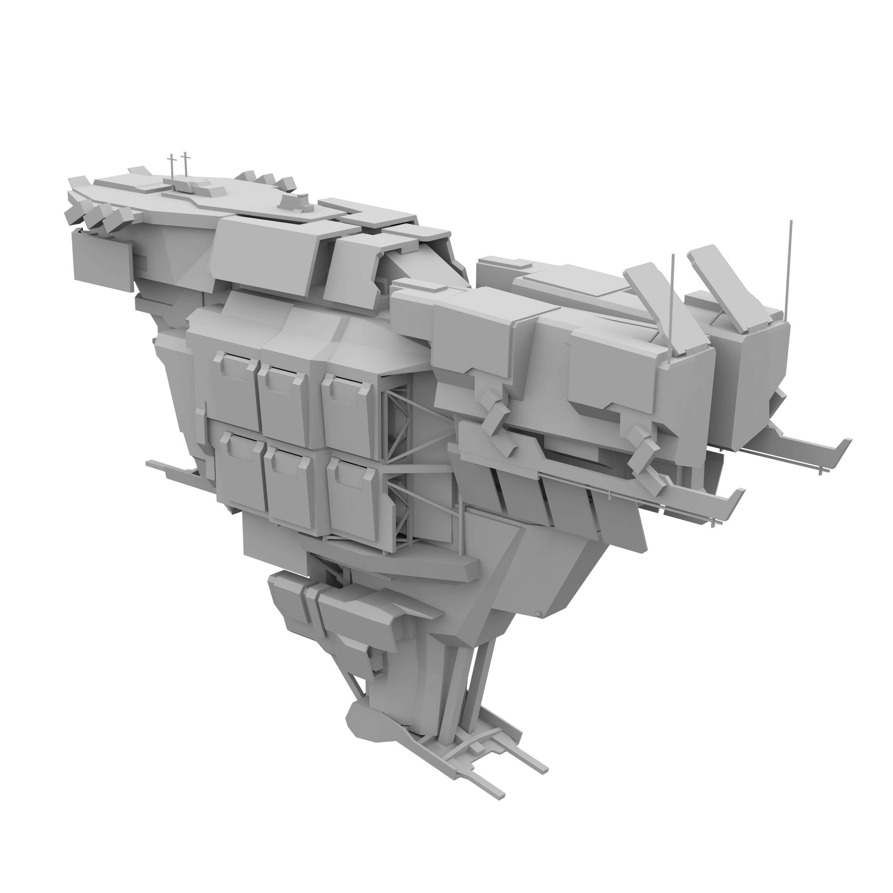
During the Rupture redesign process, we added lots of exposed scaffolding. The gun ports being exposed added the concept of using lots of negative space as a design element. I began looking at spaced armor on tanks and vehicles, and from there my reference folder was full of older World War 2 photos of vehicles. This accidentally became the defining decision process on making sure we didn’t step on Caldari design shoes, as all their ships are based on sleeker, cutting edge modern day and future military tech. Everything is enclosed into a sleek and uniform shell, with very few exposed electronics.
With Minmatar, we’ve gone the opposite way--everything should be on display. The Rupture hull would be broken up into chunky plating, with rugged functionality exposed to the space outside the hull and dark gaps in the armor exposing structural beams. The ships would be bulkier, but, unlike Gallente, most of that bulk would be composed of empty spaces rather than voluminous hull and structure. Despite being a big ship in terms of dimensions, it could still conceivably be light and fast compared to its Caldari counterparts due to the stripped down, hollow look we were going for. The oversized engines helped sell this even more.
The Rupture’s original transom rear gave us room to add large galleries of windows of generous size, compared to Caldari’s utilitarian and sparse windows. The orange glow and dark spaces gave a nice feeling that the interior of the ship was warm, playing into a recent theme of Minmatar tribal fire pits we’ve been playing with for FX. We tried to add a homey kind of glowing feel to the windows on the ship to help convey that Minmatar ships are generally more crowded with crew than other races. We also added a dedicated bay just under this area for launching drones and other small craft that a cruiser may need.

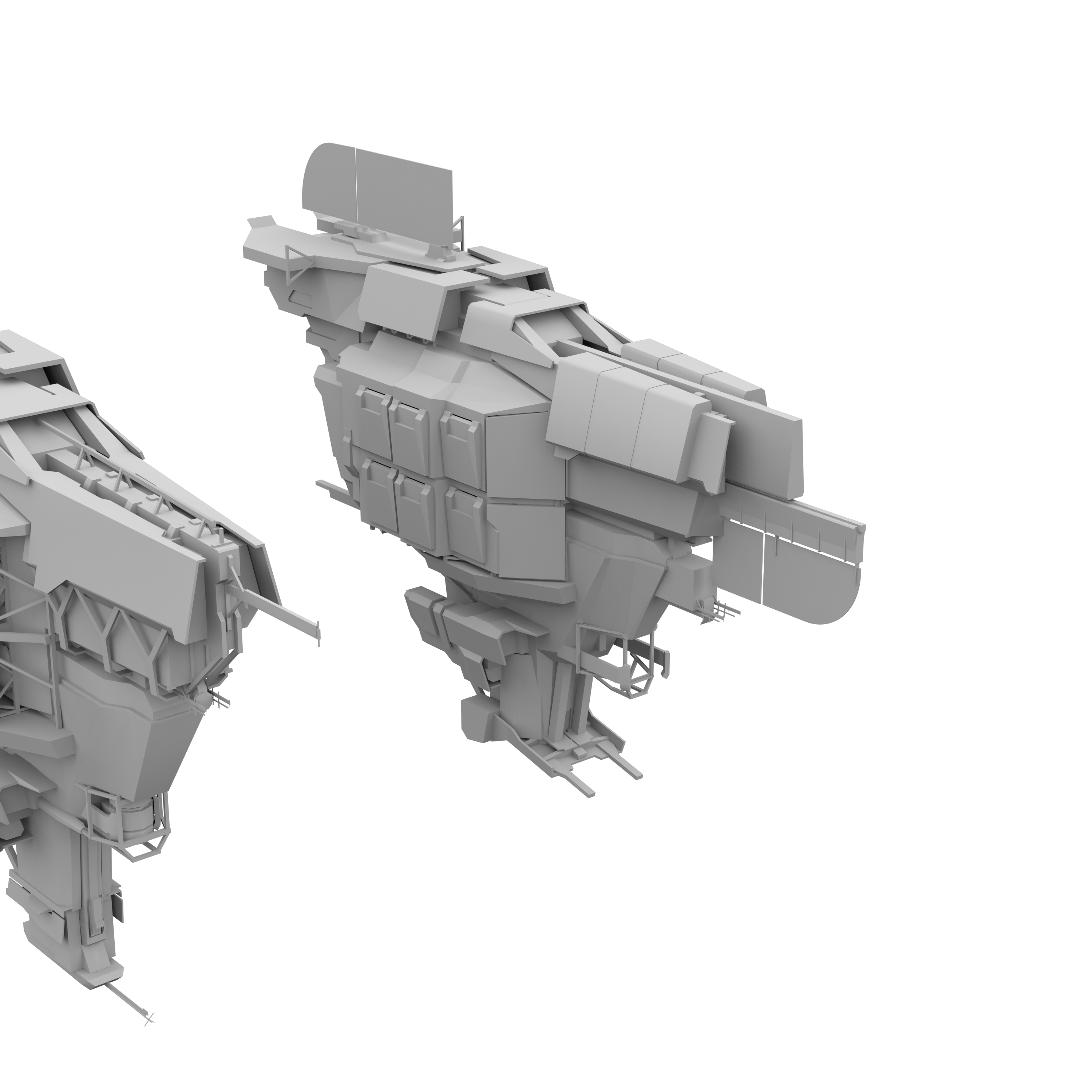
After this back and forth, we ended up with a model that was pretty final

Variation and Experimentation
Then came the next problem: the design had changed, and trying to recreate some of those early ideas from the 2d concept on this new hull just didn’t look right. I wanted the Muninn and the Broadsword to be even bulkier to reflect their extra tank bonuses. But the base hull we now had, was already so bulky we couldn’t just start adding a ton of mass without interrupting firing angles or covering up what was making the hull interesting. The hollow gun bay also meant we’d used a lot more polygons than we originally wanted, so we were limited by what we could afford from a performance standpoint. From talks with the CSM and players we’ve got a guide line that the Tech-1 hull has to stay conservatively close to the original design, but when we come to our Tech-2 hulls we can go as crazy as we want with deviation.
I spent a few days playing with some really goofy simple 3d additions, trying to find something that had the right character for what I wanted from the Muninn.


We had to incorporate Brutor curved sails somewhere, and came up with the idea of having one long hanging sail along the front a bit like a bayonet. I also had this idea that i wanted to play off the ship’s role as a ship optimized for long range artillery. While we can’t just make the guns bigger, we can play with some simple shape recognition to get across these ideas. The ship already looked somewhat like a pistol, so we exaggerated that a bit and placed another larger shape on the front like a barrel as well as some extra sensors and targeting equipment. We flattened this shape to give it some fragility, and the high surface area kind of implied it was some over-sized piece of fire control equipment using advanced sensors like the SAAB TP100 AWAC.
We also moved the bridge further down as the new sensors and sails would have blocked any attempt to look out of the previous one.
During this time, we also played with adding on some larger plating. But with the other additions the front began to become way too busy visually. I liked the hanging, spaced armor idea though, so we added these plates to the base t1 which helped visually distinguish it from the t2s.
This plating that we added to these ships needed to serve a more ambiguous role than say, with Amarr. Minmatar ships can be used with shields or armor tanks generally, so behind these armor plates I added lots of texture detail that implies some shield generation or projection role as well. Depending on what the capsuleer fits, it was conceivable these large defense plates could be serving both roles, either as reinforced plating to mitigate incoming damage, or as a large projection surface for reinforced shielding.

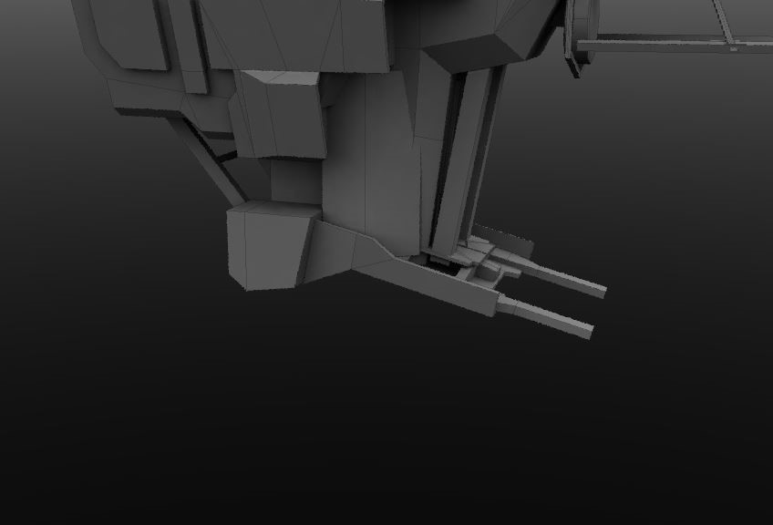
Then came the Broadsword. This one was oozing potential for functional elements and plating to reflect it’s incredibly tanky nature. I wanted the front to be entirely composed of an eccentric looking series of generators that would create the warp disruption field that defines the role of interdictors. We made it blockier, and in texturing gave it lots of small, thicker plating to look well defended like a tank. Some of the side-skirt plating came from looking at lots of kitted up Panzer tanks. We also went pretty wild with animations, giving it lots of techy stuff that flips open and unfolds, with two large aggressive tusks at the front that serve to channel and project the warp disruption field.


The Rupture is a bit unique in that it has a unique faction hull variant, the Mimir which was given out for Alliance Tournament 7 winners. We also updated the look of this variant, using the Muninn heavy assault cruiser’s hull and adding the characteristic sails of the ATVII ships as well as an extra pair of boosters.

And finally, to celebrate Tribal Liberation day, the Rupture hull will be launching with the brand-new Firewall Breach skin, sporting the design of the Khumaak, once a symbol of Amarrian power subverted into the most powerful symbol of Minmatar liberation.

We hope everyone will enjoy these new designs once you get your hands on them in the July release.